Lets talk with Angels Castro, a designer from Barcelona.


Tell us, in which field do you work?
Mostly in design and implementation areas, but I have the luck to workTell us, in which field do you work?
Mostly in design and implementation areas, but I have the luck to work with a multidisciplinary team that is in direct contact with all the field facets that are developed. From the phase of analysis in which one works elaborating a briefing, or conceiving a communication strategy, going through the process of creativity and design, untilthe final phase of implementation.
According to the necessities of each project, professionals of other disciplines like photographers, architects, or programmers join us in the project.
In my profession, I consider vital the contact with other disciplines, the Team work, learning every day with each client, each project and each collaborator.
Which is your specialization in the design area?
As part of the team in Idees i disseny, my specialization is branding.
My job’s objetive is to help companies and organizations create, manage their brands and communicate in a coherent and effective way. And this principle is applicable to the precise actions, as well as to the campaigns or the programs of greater reach. Specifically from the brand design, to the set of manifestations of the company’s identity: visual identity, publicity, commercial communication, public relations, internal communication, or even communication through conducts, all these conform what I understand by corporative IDENTITY.
Which are the necessities that a good design must cover? Exclusivity? A “flashing” look?
I believe that a good design helps to make real the strategy and the objectives of the person or entity who wants to have it made. In this sense, the brand’s communication actions have to be designed considering the key values in which the differentiation is based. The coherence is reached when these key values are transmited with the same concepts and tone in all their manifestations and supports. I believe that a “well done design” is very different from an art work, it doesn´t have to respond to the inspiration of the moment. Design is more a functional and technical discipline than an artistic one.
I admit that design is for me – a compulsive buyer and consumer – like a magic game: colors, textures, scents, flavors, sounds… how do you include each of these senses within each campaign in your mac?
Speaking in a bidimesional plane, it is possible to evoke an atmosphere where you can “feel” scents, flavors, sounds… But I believe that it is in the sales or communication place where you really play with these senses, accompanying your graphical work with a suitable music, lighting… (a global image with atmosphere). Let us say that it means equipping your graphical creation with other elements that are going to emphasize it from the rest.
Signs, symbols and corporative image… can you tell us about any “signaling” design example that you have made?
In the case of “Polis” (service areas of a freeway), the project was complicated due to conceptualizacion of the project itself and to all the elements that had to be considered, starting with specific naming, the traffic laws on signs at vehicle transit roads, and minimum details inside the restaurant of a service area.
But I am satisfied with the result although in the end this design project was not accomplished. It was a project that taught me a lot, and later, I have been able to develop other projects that I had the chance to see carried out, like “Superverd” project, a franchise on the food sector. It’s objetive was to have a change of image, because they were changing from being neighbourhood stores, to being big supermarkets.This project’s objetive was to give the “super” image with everythig that it involves, from the design of the façade, to the bags and gloves dispensers, and to the marking of packages, products, sales…
This was a very fun project, because we could manipulate the image that we created with more colors and with those senses we talked about before.
What tools of the mac and other materials did you use?
Basically paper and pencil. Then I made the presentations in Photoshop, drawing in Illustrator and preparing the originals in Freehand.
Within the process of press production, can you tell us in which phase was the color exactitude fundamental?
In all of them. Any work that takes place in the press has to be controlled from the first moment. It is important that the client sees the most approximate color to the final color result from the first sketch that you show him. In that way there are no misunderstandings about it.
The client is not interested on any technical problems you may have. You are the one in charge, and you should solve his problems of communication, not give him more. And you’re of course in charge of the quality control of the printing.
That is why it is important to have good monitors and knowledge of its different color systems, color patterns (pantones, equivalences cmyk, etc…), and above all it is very important to have a good ally at the printing press. : )
An area that amuses me is the temporary montages. What requires a proper fair stand, for example?
If we close our eyes and imagine ourselves entering through the door of a fairground, we notice immediately a certain pressure in our head, we are overwhelmed by many things, a lot of “messages”.
In this situation we stop and watch from a wider point of view to have a better perspective inorder to have an idea of composition, situation and direction (where are we, what is there to see, where do I begin, which way do I take…).
But with this first quick look, we already kept some images in our visual Memory. Reasons: personal or professional interest; we located a mark of our interest for its spectacular display, originality, volume, chaos, etc. A fair is a commercial event where everyone wants to stand out, it doesn’t last very long and it is very intense. Under these limits, we must act with calmness and rigor, without forgetting to be forceful. Therefore, a good stand, from my ponit of view, must take into consideration: Good positioning of the mark, striking global image, either through materials and construction, or through illumination, or everything all together, keeping in mind that the public must receive a comprehensible second level information, therefore one must quickly know what does the potential client do. The stand must create enough curiosity in order to arise interest on what you don’t see at a first glance. In this sense, I believe that a well constructed and well codified information architecture is essential.
What differences are there between the design of the signs in a museum and in a supermarket for example? Are there any “forbidden” materials?
It is evident that we start from very different comunication necessities.
Although apparently the signs are there to guide and inform, the criteria and objectives aimed are very different. In the supermarkets the signs inform and guide, but the criteria of merchandising has a specific interest, we mean the actual filling of the shopping trolley, something usual, the moment of buying, of the impulse and category of the products exposed. We inform about the different departments and its products: fresh or daily products, drinks, frozen, cleaning… The point of view is very pragmatic, at the end the objetive it is to fill the shopping trolley and take something tangible. In these examples, the component of the projected corporative image on the signs is important but relative, it mainly has to be functional, we can say that the function prevails over the form.
In a museum we also guide and inform, but the routes are usually rigid and they have to respond to an understanding criteria on what there is to see. The signs respond to criteria of temporality, narration, etc., the information is over the function. In the end, we are telling a story or many stories in a common space. In the previous case the visitor will take with him something tangible, in this example he will get an impression, an experience, something intangible, a sensation.
The signs in a museum take much more care of perceivable components of corporative image and mark the style, the form and even the constructive materials.
Tell us about your work method: do you already have the idea when you seat down with your mac, or does it generates and changes while you are working?
My Mac is my tool of work, but it is not the mouse the first thing that I use to begin working. The first thing is to study to the client and his competitors. Once I have documented myself, I elaborate a contrabrief to define the communication objectives, texts, slogans and all that information that will be shown in the campaign or in a precise action (poster, catalogue…), always in agreement with the client. When it has been approved, we begin to visualize the design the graphics. I make sketches and proposals to comment with the rest of the team and we begin to work. Photographies are entrusted to a professional, if it is the case, we work on visual illustration, scale model and a presentation to the client is prepared. We meet and we comment the as many times as needed. Then we only have to prepare the originals for production.
Which mac and peripheral machines do you use?
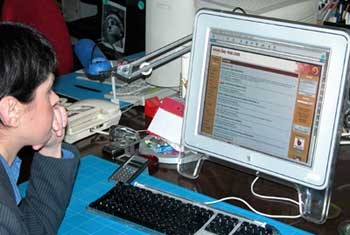
Basically G4 933mhz and intuos graphical tablet A5. Scanners in order to digitize at level scale model and my old but effective Powerbook g3 for presentations, or when I’m going from one place to another, either in Barcelona or outside my city, (I wouldn’t be sad if somebody is thinking about giving me a TiBook, one of those 17” that run around… At home I still have my dear iMac g3, that I use basically to connect to the network, to surf and to chat with faq-mac people 🙂


Is there a special aesthetic to “sell” a sound, in flyers for discs, for example? What rules can you leave out?
More than an aesthetic, I believe that there are fashions. In this field look changes with fashion, either the formats or graphics. It is certain that the places where they mainly play machine music, use 3d graphics, surrealistic, textures, hallucinogenic scenes, comprehensible for the type of public they are meant to attain. However, the places that play commercial house music, ambient, the one called “chill out” that is “in” at the moment, are more minimalist, 2D graphics with flat inks, drawings of djs, in gray or backgrounds, clear helvetica fonts, visible types, etc…
Clubs or discos that play avant-gardist music return to a ”retro” look, using images of women “pin ups”, and drawings and textures similar of the best wallpapers of the 60’s.
Rules? hehe, I believe that there are no rules: the more impressive, and sometimes even the more offensive, the more public you will catch. The music club flyers are often signs of rebellious philosophies, with the intention to be unmarked from a conventional way of life. The flyers have to communicate these different premises of the club, so you have to go there because you are diferent, you are young, rebellious and original too. It is the main message of a great number of flyers.
Here in Barcelona there is a culture of all this, in fact, comprises a speciality of the design, it is part of the “club culture”. To be a designer of flyers means to be cool, you are “chic”, it has its touch of glamour.
Flyers and posters: What countries and designers do you think seem to be sharpshooting actually?
I believe that London goes one step beyond the rest of the cities, talking about design. Mainly in any of the fields, like this one we talk about.
I follow the work of some designers, but mainly of agencies. I have my favourites, but I believe that there is no one that is marking tendencies. But I can tell you about someone, under my opinion, who sets aestheic standards that are even being followed, like it was at his moment David Carson with his chaotic typesetter designs, and Neville Brody, I feel great affinity with his works, which are very clean, legible and effective iconic designs. I believe that the design of Brody is followed by many designers, some even don’t know him, but there he is. I really invite you to know his works.
Let’s talk about Spontz ¿What is your job with the scene group about?
My responsability is to contribute with ideas and to comment them with the rest of the group to see their viability, I basically dedicate to 2d subjects, textures and preparation of graphics that can be needed. At the moment, I am learning about 3d, with lightwave, to be able to contribute more to the group as a designer.
What do you take into consideration with the graphics for Spontz?
There are several things consider, first, that they are viable graphics and respond to the necessities of the demo, but mainly the image formats that can be easily loaded, but for this I have good advising from Merlucin and the rest of the group (Dios, Infinity, Jano, Kolian, Marc, McBrain, Ximac, Xphere), that they are experts on gfx and programming.
Which projects do you have actually?
Surprise 🙂
Which was been the most dificult job in a concept level that you have done?
Uff! I believe that all projects have their part of conceptualización and difficulty. You have to go on, to document yourself and to follow a method. It is an approach of dedication and focus, I have to say, that the most difficult projects are those that come barely or badly documented.
¿Do you use X system? ¿what do you you miss in your mac?
I don´t use X daily, I use it only for concrete things or to experiment with it. My daily work develops basically in OS 9,2 even,QuarkXpress which I still use a lot.
What do I miss? mmm there is nothing specially that I miss, I am very happy with it, but I´ll tell you that more reasonable prices woudn’t be bad, I spend the year working to be able to update for the following year, this way I can never go to the Seychelles in holidays! 🙂
Speaking of design, perhaps the field that is more invaded by macs as a work tool, where is the character, the style of each designer that marks the difference?
The difference is marked, basically, by the quality of the project, understanding quality as the creative necessities that are required, where the designer can really give original solutions fulfilling and responding to the objectives marked by the client.
With the diffusion of Internet, all the companies and organizations begin to feel the necessity of a “logo” and an image in the network. How has this affected the style of the design? Do you think recognizable national styles (like the classic British, or the Russian) exist. or tends to a greater neutrality? Are there “fashions” in Internet that go beyond the network to life? What tendency reigns today in the www?
A lot of questions 🙂 by parts:
The image that you can design for a company counts now with new support. Let us say that it comprises the determinants for the creation of a good mark, just as its resistance to the reductibility, application to black and white, and color, to an ink, etc… It now has to be able, too, to be legible in the Web support.
National styles?, less and less. But they still exist. The British style and the Russian constructivism still have followers, by its impressive and forceful form of communication, but more and more the designer is soaked into foreign influences, I do not know if we will also arrive at a global design by this way… I believe that it is not bad to conserve those national styles, because in the end it is something that enriches with property the culture.
“Fashions that go beyond the network”… Yes, it is fashionable to design catalogues with a website criteria, but printed. I suppose that’s s to give tech style to them, but personally I do not believe that is functional. When you design a poster, you design it for a concrete support, a catalogue is another thing, and the Web is a very different one, besides, there it has to respond to criteria and architecture of information very different from the designs offline.
What would you like to design that you have not ever done?
A music club. From the facade, to label, glasses… even the tickets of cloakroom. Tables, chairs, scene… posters that decorate the space, etc… everything. I would like to design an “atmosphere”.
Finally, what would you change in the design of a mac? 🙂


I would recover our ”dear” classic bomb with a new Aqua design 🙂
Thanks Angels, it has been a pleassure talking to you : )
Thanks to you.
I hope to meet you at Campus 2003 : )))
idees i disseny (c)omunicació gràfica
Pujades, 74-80 1er 3a
08005 Barcelona
Tel. 93 356 80 10
fax 93 356 80 11
e.mail: angelss@ideesidisseny.com


